
“Small businesses with websites grow 2X as fast as those without.”
– Businessdasher.com
Picture this:
You’re organizing a big event and need to rent some high-end audio equipment. You search “Audio equipment rental near me” and find a promising rental company near the top of the search results with awesome reviews.
Eager to check out their gear, you click on the link. But then, the frustration sets in – the website takes forever to load. You refresh, try again, and still, it’s as slow as molasses.
Instant rage quit.
There are plenty of other rental services in the area, and you’re too pressed for time to deal with a sluggish website. This is a classic example of bad user experience in the world of website design, and this issue is known as a silent killer of conversions across many industries, especially for party rental businesses.
But here’s the good news: This issue is surprisingly easy to avoid, even for beginners! In this blog, we’ll dive into some best practices in website design that you can use to keep your site speedy and your customers happy.
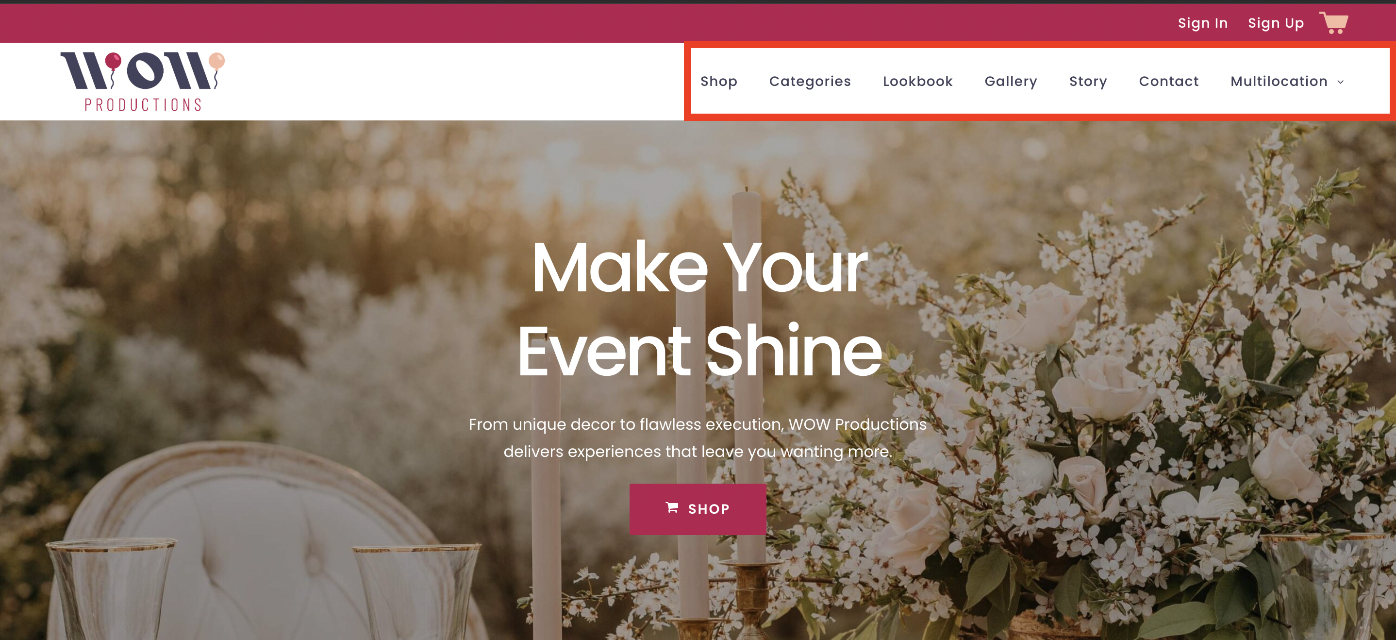
1. Best Practices in Website Design for Navigation
When we talk about navigation on a website, we’re referring to how simple it is for your customers to find what they’re looking for and move around your site. Just as clear signs in a store help you find the checkout counter or the electronics section quickly, a well-structured website helps visitors easily locate the information they need — be it pricing, product details, or how to contact you.
Good navigation should feel intuitive, meaning users shouldn’t have to think too hard about where to click next. For a rental business, this could mean having clear menus for different types of rental equipment, a straightforward way to return to the homepage, and simple steps to follow for booking a rental or making a purchase.
Keep It Simple & Intuitive
When setting up your rental business’s website, the key is to keep everything straightforward and easy to understand. Think about what your customers are looking for—maybe it’s party supplies, construction equipment, or audio-visual gear. Label your menus clearly with these categories so visitors can spot what they need right away without any confusion.
Try to keep your main menu options between 5 to 7. Having too many choices can be overwhelming, making it hard for customers to decide where to click. Stick to essential categories and perhaps a couple of important pages like ‘Contact Us’ or ‘Book Now’.
It’s also very important to use simple, everyday language that anyone can understand. Instead of technical terms or industry-specific language that might be confusing, use familiar words. For example, use ‘Pricing’ instead of ‘Fees Schedule,’ or ‘Help Center’ instead of ‘Client Support Services’.
Use Descriptive Labels
Vague labels like “Products” or “Services” can leave your visitors guessing what you offer, which might lead to them missing out on exactly what they need. Instead, opt for more specific, descriptive labels that directly tell your customers what they can find under each category.
For instance, instead of a generic term like “Products,” use “Tent Rental Options” if you’re in the party supplies industry. If you provide audio equipment, “Audio Gear Rentals” is far more descriptive and useful than just “Products.”
When you use descriptive labels, you help guide your customers directly to what they need. This reduces the time and effort they spend searching. Descriptive labels make your website easier to navigate, which increases the likelihood of a customer choosing to book with you.
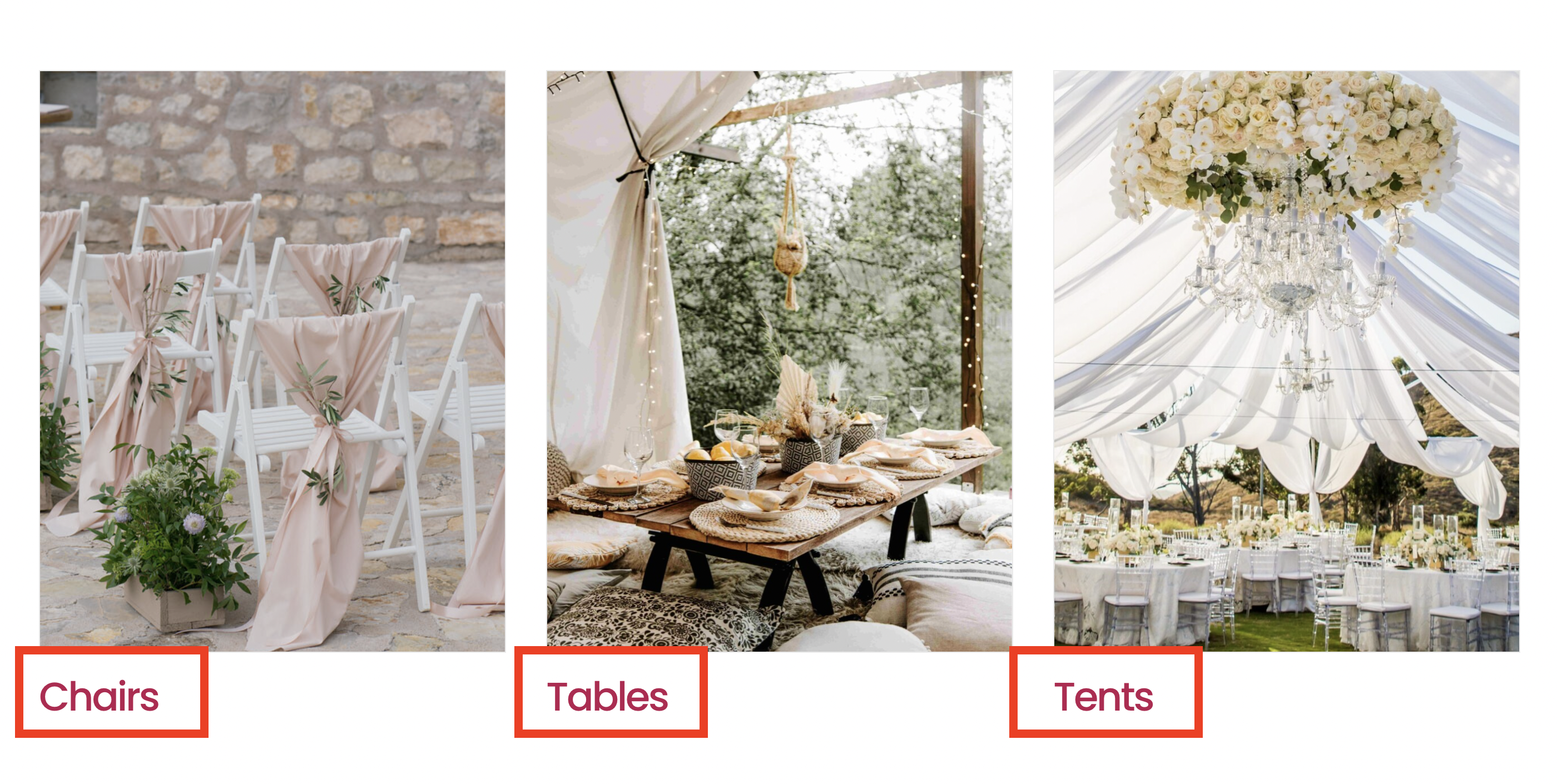
Understand Hierarchical Organization
Hierarchical organization in website design is the process of organizing and prioritizing content to guide users naturally throughout the site, ensuring that important elements stand out. Imagine your website as a well-organized filing cabinet, where every item has its place, making it easy for anyone to find exactly what they need without any hassle. This is especially important for a rental business where customers are often looking for specific items to fulfill their immediate needs.
Top Level – Main Categories: These are like the top drawers of your filing cabinet. Each drawer represents a primary aspect of your business. For a rental business, these categories could be broad, like “Event Equipment,” “Construction Tools,” or “AV Technology.” This level gives a clear, broad view of what your business offers, helping visitors immediately see the range of products you provide without diving into too many details right away.
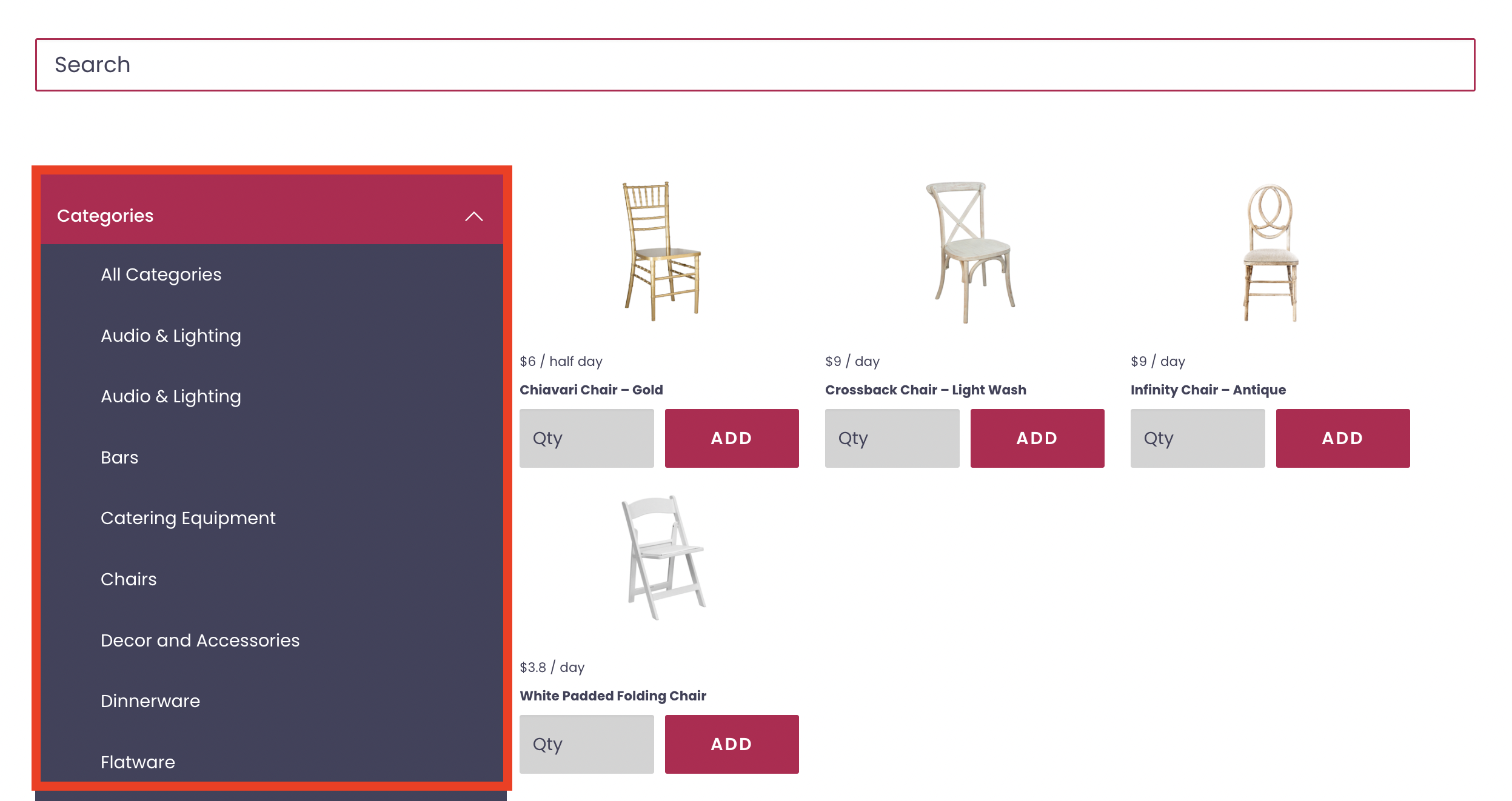
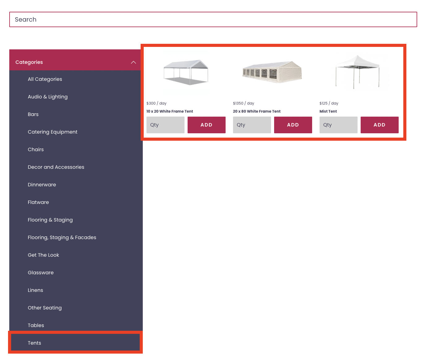
Second Level – Subcategories: Under each of these main categories, you have folders — these are your subcategories. They help organize your offerings into more specific groups, making it easier for customers to navigate and find what they’re looking for. For instance, under the “Event Equipment” category, subcategories might include: Chairs & Tables, Party Tents, and Decorative Lighting.
Use a Top-Down Approach in Navigation
Start with broad categories and narrow down to more specific items. This helps users make sense of your offerings without feeling overwhelmed. They can start by viewing all the event equipment you offer and then drill down to find exactly the type of tent or lighting they need.
This approach reduces the cognitive load on your users. Cognitive load refers to the amount of mental processing power required to navigate your site. Less clutter and well-defined categories mean less strain and a quicker, more pleasant browsing experience.
Once a visitor has selected a broad category that interests them, your site can guide them to more specific subcategories and items. How does this help?
From a broad category like “Event Equipment,” a user might click through to subcategories like “Tents,” “Lighting,” or “Tables and Chairs.” This subdivision allows them to explore only the relevant items without distraction from other unrelated equipment.
If they choose “Tents,” show the different types of tents you offer, such as canopy tents, pole tents, or marquee tents. If you provide enough information about each option, including sizes, materials, suitable events, and any additional accessories available for rent, your customers can quickly make an educated decision on which rental they need for their event.
Keep It Consistent
Make sure that the way you categorize items is consistent. For instance, if you use a specific naming convention or a certain way to organize products under one category, use the same method under all other categories. This consistency helps users learn how to navigate your site more quickly and easily.
Link Clearly and Logically
Within your website’s pages, always link logically. For example, a page about party tents can have links to related items or services like lighting and dance floors. This not only makes it easier for users to find related products but also encourages them to spend more time on your site.
Optimize for Mobile Navigation
Over 60% of website traffic comes from mobile devices
Based on that data, we know that most people searching for products and services nowadays are using their cell phones to do it. That means that if you want to increase conversions from your website, mobile optimization is one of the most important things you can do.
What is mobile optimization? Simple: it is the process of making your website easy to use for people who are using their phones to access it! Websites that are difficult to use on mobile are connected to low conversion rates, so this is a best practice in web design that you do not want to skimp out on.
So, how do you do it?
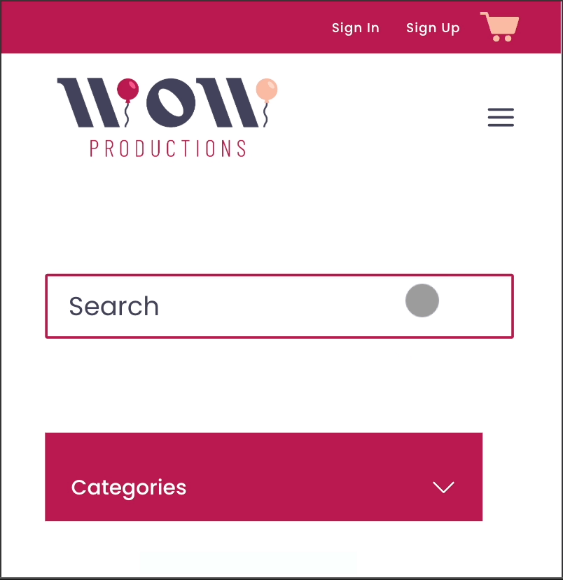
Hamburger Menus
One effective tool for mobile website design is the “hamburger menu.” This is an icon made up of three horizontal lines (☰) that you typically see in the top corner of mobile websites.
Tapping on this icon will open up a dropdown menu containing all the site’s pages. This type of menu is called a hamburger menu because the stacked lines resemble a hamburger. The hamburger menu helps clean up the layout on smaller screens by hiding the navigation links that would otherwise take up valuable screen space.
Make Navigation Touch-Friendly
On mobile devices, your customers will be navigating via touch rather than a mouse click, so it’s important to design your website accordingly:
- Touch-Friendly Buttons and Links: Make sure all buttons and clickable areas are large enough to be easily tapped with a finger. Small buttons or links that are too close together can lead to accidental clicks and a frustrating experience.
- Simplify Interactions: Where possible, simplify the number of actions a user has to take to find information or make a booking. Each additional step or complication can potentially lead to losing a customer’s interest.
- Scrolling and Accessibility: Ensure that your website scrolls smoothly on mobile devices. Avoid anything that requires a user to zoom in to read text or see images clearly, as this can deter them from using the site.
Avoid Overloading with Links
Overloading your site with too many links can confuse visitors, making it difficult for them to decide where to click and potentially diluting the impact of your most important pages. Presenting users with too many choices can lead to decision fatigue, where the more options they have, the harder it becomes to make a decision. Generally, each page should only have one clear CTA like “Add to Cart” or “Request a Quote”.
2. UX Best Practices for an Engaging Website
User Experience, or UX, refers to the overall experience a person has when interacting with a website or digital interface. It encompasses all aspects of the end-user’s interaction with the company, its services, and its products.
The goal of UX design is to guide visitors through your website in a way that feels natural and leads them to take action, like booking an order. In this section, we’ll dive into best practices in website design in the context of UX!
Prioritize Page Speed
Users typically have little patience for slow websites. If your pages take too long to load, potential customers are likely to leave and visit a competitor’s site instead.
This issue can also negatively affect your search engine optimization (SEO), making it harder for potential customers to find your rental business online. Search engines, like Google, prioritize faster websites in their rankings. A quicker website means better visibility to prospective customers searching online.
To increase page speed, first use Google PageSpeed Insights to analyze the content of a web page. This tool will generate suggestions to make that page faster. Simply enter your URL, and you can see how well your site performs and get specific recommendations for improvement.
Make sure the images you use are not too large. Large images can significantly slow down your pages. Optimize your images by compressing them without losing quality and by choosing the correct format (JPEG for photos, PNG for graphics with fewer than 16 colors).
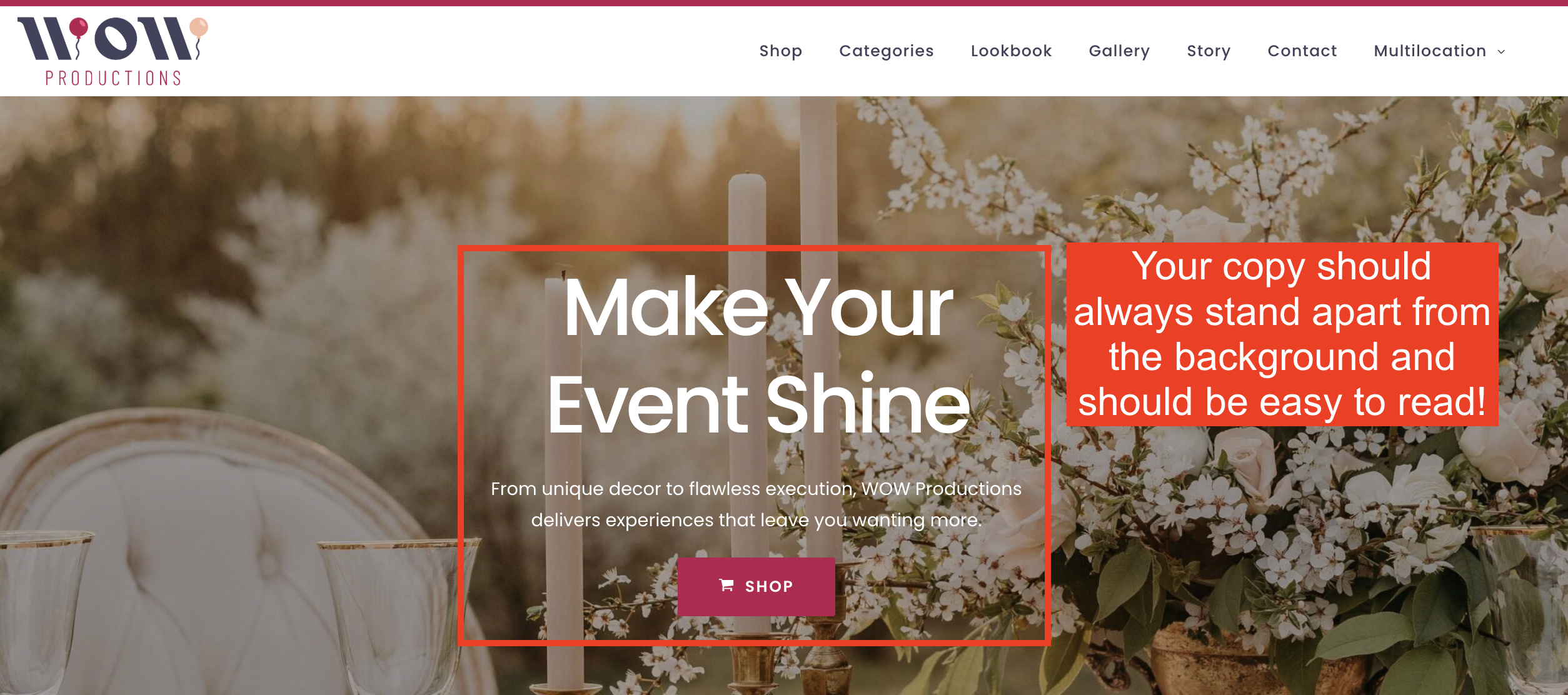
Design for Readability
Select fonts that are easy to read online. Sans-serif fonts like Arial, Helvetica, or Google’s Roboto are popular because they’re clean and simple. Avoid using fancy or script fonts for body text as they can be difficult to read. You should also ensure that your text is large enough to be read easily on all devices, typically at least 16 pixels for body text.
Use high contrast between text and background colors to make reading effortless. Black text on a white background is the most readable, but other high-contrast combinations can also work well. Avoid combinations like light grey on white or dark grey on black, which reduce visibility. Additionally, stick to a simple color palette that reflects your brand but doesn’t overwhelm your content.
When you structure your content, break it down into manageable, short paragraphs. Large blocks of text can be intimidating and hard to digest! You should also use headings and subheadings to organize content and guide readers through your pages. This is also a great way to incorporate key search terms into your headings, which is an effective Search Engine Optimization (SEO) strategy.
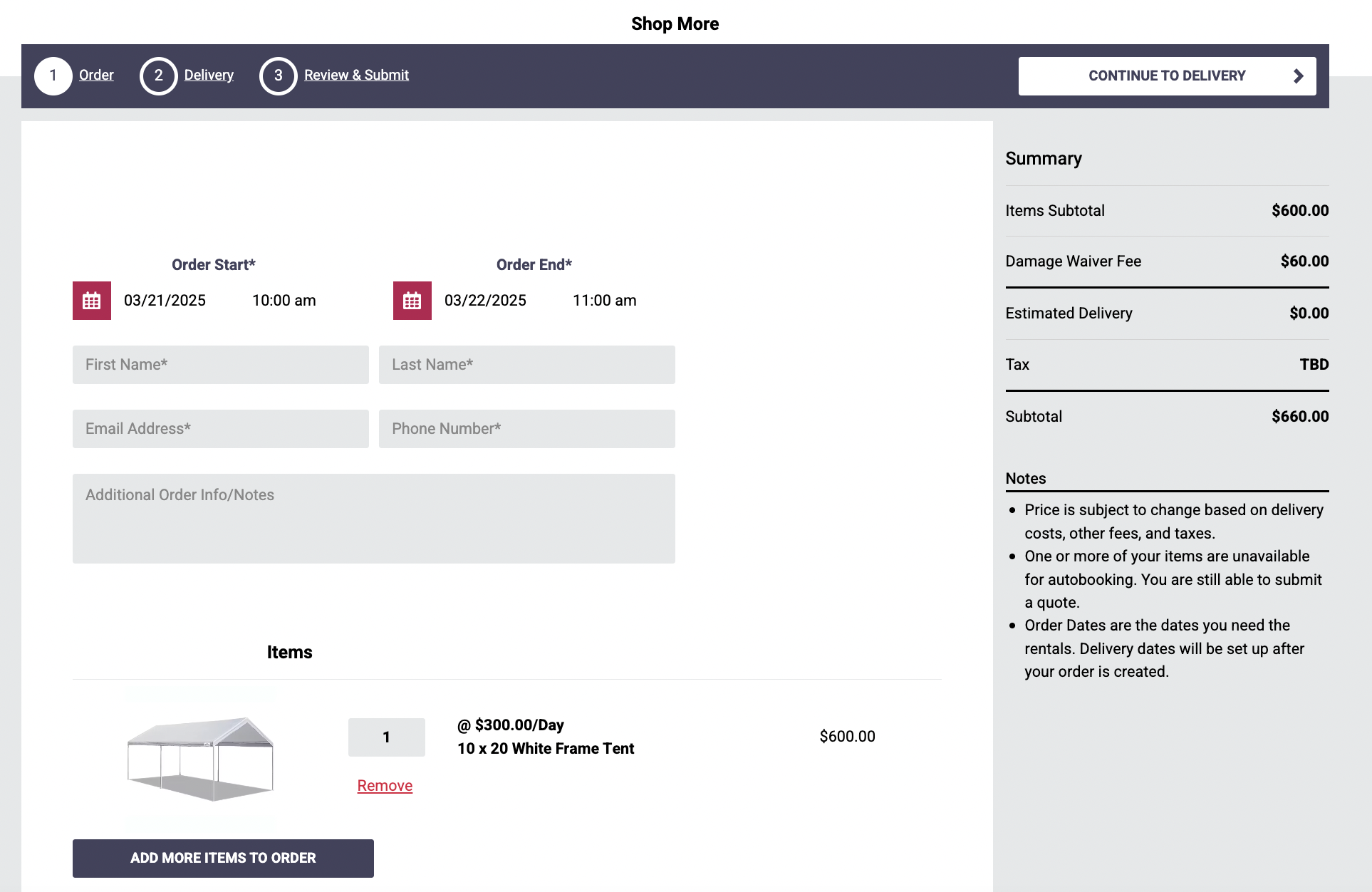
Minimize Friction in Forms & Checkout Processes
Many rental businesses hesitate to include an online shop on their website – which means that customers cannot complete their reservations independently. For customers, this can represent a big point of frustration and can even hurt your conversion rate! Customers will go where their experience is more convenient. And when we live in the world of Amazon, businesses that can provide a seamless experience will always win out with impatient shoppers.
So, how do use best practices in website design to minimize friction and give customers the experience they crave?
Simplify Forms
Ask only for essential information in your forms. Each additional field can increase the likelihood that a customer will abandon the process.
Focus on gathering information that is absolutely necessary for the rental or booking, like name, contact information, and rental details.
Offer Guest Checkout
Not every customer wants to commit to creating an account, especially if they’re in a hurry or are unsure if they will be repeat customers.
Offering a guest checkout option can reduce drop-offs and speed up the process. This can be particularly appealing for clients who need quick rentals without the hassle of account management.
Add an Online Shop
While many rental businesses traditionally operate through direct inquiries and manual booking systems, an online shop can significantly enhance your efficiency and appeal. An online checkout system not only offers convenience but also caters to the increasing preference for making online transactions.
Rental software typically comes with pre-designed templates and user-friendly interfaces that allow you to set up an online shop and process checkouts quickly.
These tools are designed with the rental industry in mind, ensuring that they cater specifically to the types of transactions and information handling you need.
Build Trust with Clear Messaging
In the rental industry, trust is a key component of customer relationships. When clients feel confident in your services, they are more likely to book with you. Your website plays a crucial role in building this trust from the first interaction.
Showcase testimonials and reviews prominently on your website. Positive experiences from past customers reassure potential clients about the quality of your service. Consider dedicating a section of your homepage to featured testimonials and include a link to a page with more detailed customer feedback. Additionally, link to your profiles on third-party review sites like Yelp, Google Reviews, or industry-specific platforms.
Include any industry certifications, awards, or memberships that highlight your expertise and credibility. If you offer online booking and payments, display security badges from your payment processors. These indicate that you use secure methods for handling transactions, which is essential for protecting customer data.
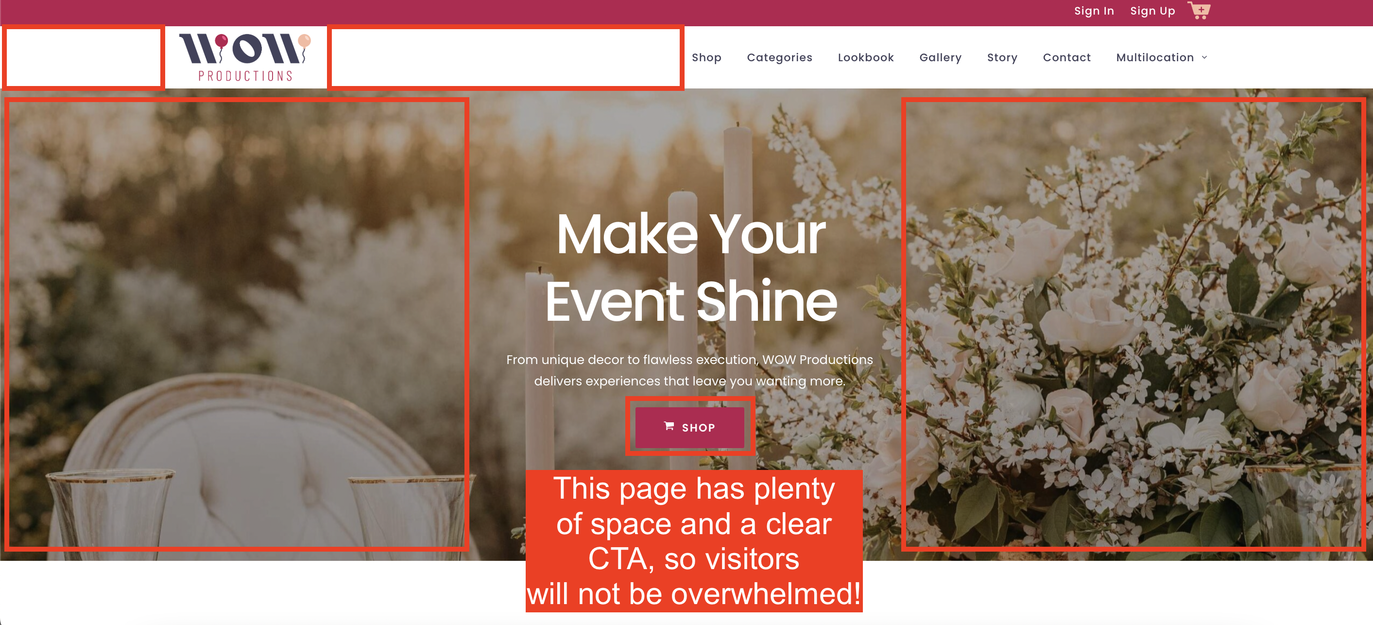
Leverage White Space/Empty Space Effectively
In web design, white space, or negative space, refers to the areas of a page left unmarked—the spaces between visuals, groups of content, or lines of text. White space around text and titles can increase comprehension by up to 20%. It helps users focus on the content without distractions, making your website easier to read and engage with.
In simple terms, white space reduces clutter. Clutter can overwhelm users, making them less likely to engage with your content or explore further. A well-spaced layout allows users to absorb information in manageable chunks. It separates different topics and ideas, which helps prevent the feeling of being overwhelmed by too much information at once.
Websites with plenty of white space are often perceived as more visually appealing and professional. This perception of sophistication can increase the credibility of your rental business, suggesting a high level of professionalism and attention to detail.
To use white space effectively, identify the core elements of each page (like headlines, text, images, and buttons) and make sure they have ample white space around them. Experiment with different amounts of white space to find what works best for your specific audience.
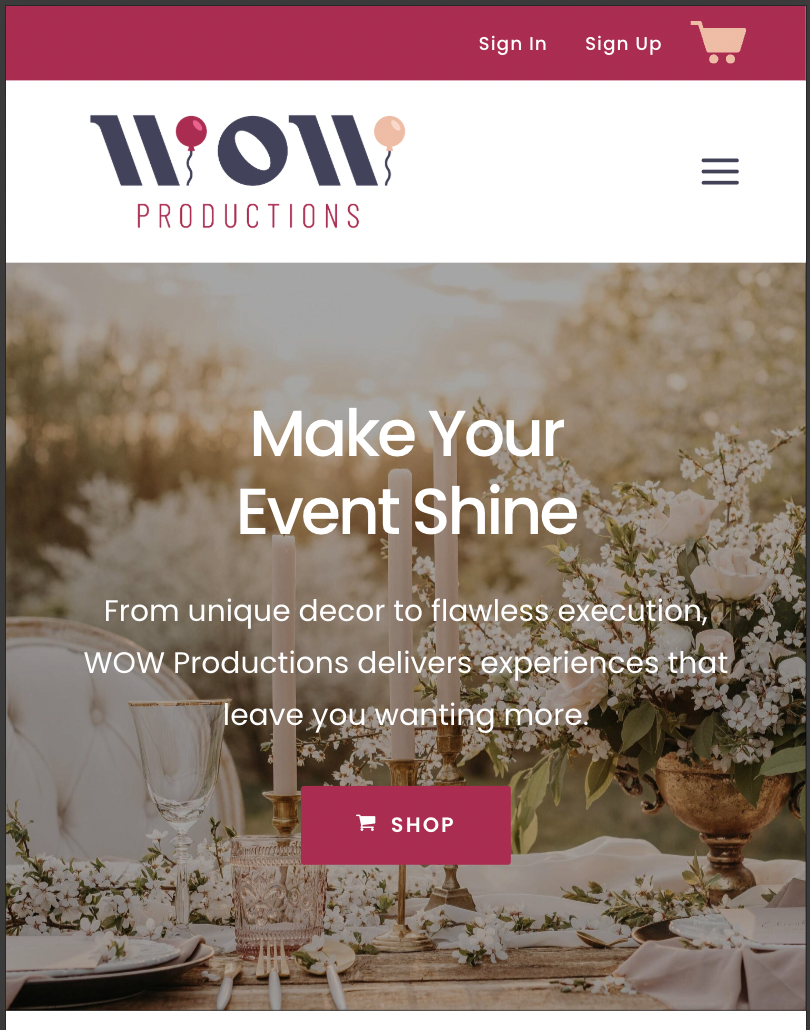
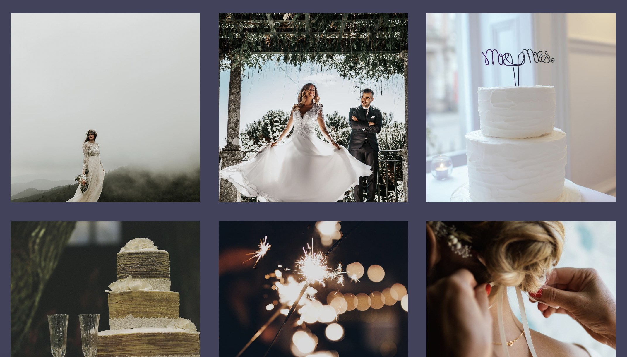
Use Engaging, High-Quality Visuals
High-quality images and videos immediately grab attention and can make a strong first impression. They show your products in the best light and can significantly influence a customer’s decision to engage with your business.
Considering the impact of visuals, it might be worth investing in a professional photographer to take high-resolution photos of your inventory, warehouse, and operations. Professional photos not only look better but are also more effective in showcasing your products’ best features and overall business professionalism.
While high-resolution images are crucial, they need to be optimized for the web to ensure they don’t slow down your site. Remember to use your image compression tools that reduce file size without compromising the visual quality, or ask your photographer if they can do this for you.
3. SEO and Accessibility Considerations
All of these best practices in website design leading up to this point impact Search Engine Optimization (SEO). SEO is the process of optimizing your website to rank higher on search engines like Google. A higher quality website that is relevant to users searching for your services equals a higher ranking.
Easy, right? It’s not that simple – there are a few more things you’ll need to consider if you want your awesome website to rank in the top 5 results on Google.

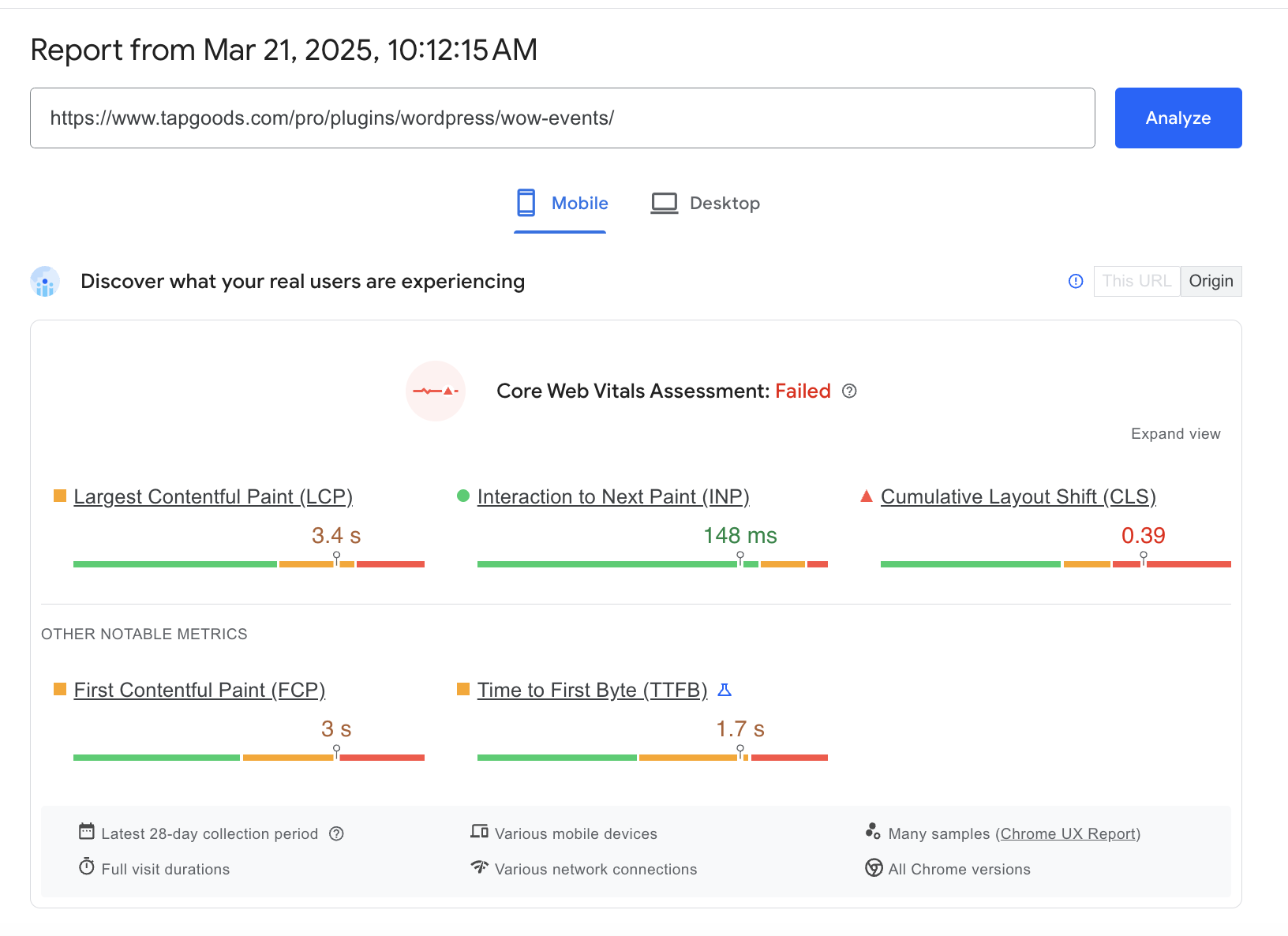
Optimize for Core Web Vitals
Google’s Core Web Vitals are a set of specific factors that Google considers important in a webpage’s overall user experience. These metrics are part of Google’s larger Web Vitals initiative designed to provide unified guidance for quality signals that are essential to delivering a great user experience on the web.
The three Core Web Vitals focus on aspects of page speed, responsiveness, and visual stability, which can significantly impact your site’s performance and search rankings.
Understanding Core Web Vitals
- Largest Contentful Paint (LCP): This measures the loading performance of your site, specifically how long it takes for the largest content element on your page to load (like a video, image, or block of text). For a good user experience, LCP should occur within 2.5 seconds of when the page first starts loading.
- First Input Delay (FID): This measures the interactivity and responsiveness of your site. It captures the time from when a user first interacts with your site (i.e., when they click a link, tap on a button) to the time when the browser is actually able to begin processing event handlers in response to that interaction. A good threshold to aim for is less than 100 milliseconds.
- Cumulative Layout Shift (CLS): This measures the visual stability of your site. It quantifies how much visible content shifts around unexpectedly. A low CLS ensures that the page is delightful to use; pages should maintain a CLS of less than 0.1.
You should use Google PageSpeed Insights to test the Core Web Vitals and other performance metrics of your site. Go to https://pagespeed.web.dev/. Simply enter your website’s URL, and it will analyze the content of your web page, then follow the suggestions to make that page faster.
Website performance is not a one-time fix. It requires ongoing attention and adjustments. Regularly monitor your site’s performance and update it according to the latest optimization standards.
Structure Content for SEO
Structuring your content with SEO in mind can greatly increase your site’s chances of showing up on search engines. Here’s a few ways to do this:
- Keyword Optimization: Identify and incorporate relevant keywords that potential customers are likely to use when searching for your services. These should appear naturally in titles, headers, and throughout the content.
- Quality Content: Produce high-quality, engaging content that addresses the needs and questions of your audience. Google prioritizes content that provides value to users.
- Meta Descriptions and Title Tags: Craft compelling meta descriptions and title tags that accurately describe the content of your pages. These elements are critical as they influence click-through rates from search results.
- URL Structure: Use SEO-friendly URLs that are simple and easy to understand. Ideally, URLs should include keywords and be structured logically.
- Use of Headers: Organize content using headers (H1, H2, H3) to make it easier for readers and search engines to understand the structure of your content.
To learn more about Search Engine Optimization, check out our beginner-friendly guide to SEO for rental businesses here!

4. Combining Navigation, UX, and SEO for a Winning Website
To truly follow the best practices in website design, navigation, UX, and SEO must work in harmony. These elements are interconnected, each playing a pivotal role in how visitors interact with your site and how easily they can find it online.
Examples of Well-Designed Sites
Consider how websites like Amazon and Airbnb use these elements effectively. They feature clean, intuitive navigation systems, high-quality content optimized for SEO, and user interfaces designed for excellent usability.
These sites make it easy to search for products or rentals, with filters and suggestions that enhance user engagement and satisfaction.
Continuous Improvement Strategies
- Track User Behavior: Tools like Crazy Egg allow you to see how visitors interact with your site, providing heatmaps, scrollmaps, and other visual data. This insight helps you understand what works and what doesn’t, informing necessary adjustments.
- Run A/B Tests: Test different versions of your pages to see which layouts, content, and features lead to the best user engagement and SEO outcomes. A/B testing helps refine your website iteratively, enhancing both UX and SEO.
- Data-Driven Adjustments: Use data from tools like Google Analytics to track key performance indicators (KPIs) such as bounce rate, session duration, and conversion rates. This data not only informs SEO strategies but also helps you gauge the effectiveness of your UX enhancements.
- KPI Monitoring: Regularly review your KPIs in Google Analytics to measure success and identify areas for improvement. Metrics like page load times, traffic sources, and user paths through your site can provide critical insights into both UX and SEO performance.
Need help? Let’s talk!
If you’ve gotten this far, you might be a little overwhelmed. That’s totally okay! If you need a hand, check out our partner: Twelve Legs. Specializing in website development, Twelve Legs brings a wealth of expertise and a proven track record of success in creating websites that not only look great but also rank well in search engines and deliver a superior user experience!
To learn more about how Twelve Legs Marketing can help transform your website into a powerful business tool, visit their website at Twelve Legs Marketing. You can find detailed information on their services, view case studies demonstrating their work, and schedule a consultation to discuss your specific needs.
Other blogs you may find helpful:
Best Practices for Pricing Rental Inventory with a Calculator
Best Practices for Rental Inventory Management and Tracking
How to Automate Parts of your Rental Business and Maximize Efficiency and Profits
Frequently Asked Questions
To help your website load faster, ensure that your images are not too large and minimize intricate content on landing pages. Utilizing tools like Google PageSpeed Insights can help identify and rectify issues that slow down your site.